Dedicated to all of you who earn for a living, or want to, by doing freelance graphic design jobs on contest platforms.
Limited to freelancers, which, sam as I, focus their skills on logo design, with occasional egress in corporate branding or stationary design. Web and UI designers, trust me, this is not intentional, but your story demands a lot more space, but keep reading, maybe you like some ideas.
Tips are collected from my first year experience as freelance designer on popular design contest platforms such as 99design and Geelancer
I apologies in advance to all those design puritans, for I will diminish the terms such as “branding”, “brand identity” and “corporate branding” by calling them “logo design” and “stationary design” for the purposes of this blogpost. Its not that I do not differentiate them. But, know this, logo design contest is just that. A contest for designing a logo. Nor a client demands full book of graphic standards, neither you are obligated to spend you energy and time on stationary design.
Lets be realistic, neither is that the brief of the contest, nor are you payed for that. But, there is always a but, if that is your wish your offer that as well, then be ready to make a print preparations, for what you demonstrated and presented. For free, ofcourse. Trust me. There is a saying in Serbia: “Who gets burned by the milk, blows in the cold yogurt”. I saw that all. Felt on my skin.
Anyhow, here is the list, how to ease handover phase after winning a contest. The advices are very effective. I got vast amount of great feedback by clients over the years.

1. First, asume that client is not a graphic designer. He doesn’t know how to prepare design for printing. For anything else, for that manner. He will not know how to correct your error, which will be spotted by his printing office or agency which he is working with. This will come back to you, like a Karma, biting you in da ass. Because you will be mark as incompetent. Also, he will then bother you days after finished job, for correction. Dont forget: time is money!
2. Go back to advice number 1. Yes, really. I overlooked this advice many times. Remember, client doesn’t have to be graphically literate! Its your job, not his.
FILE FORMAT
3. If you applied on logo design contest, and if client did not ask for whole book of graphic standards thingy with original files, the rules says that the logo is delivered in some of the vector graphic formats. I use CorelDraw and always deliver the files in CDR format, BUT I also export them in several well known vector formats such as Adobe Ilustrator AI, Adobe Acrobat PDF and EPS.
4. While preparing original vector files I always save as older versions of the program. Only because pirated programs are well available on net, doesn’t mean that the client is using that possibilities. Because, you know, its against the law. Maybe he is using Corel 12, or Adobe CS. So, please, do donwgrade your version of the file, the client and his printing and/or agency partners will be much grateful to you.
5. If you used some of the standard implemented effects (such as transparency), bear in mind that if something looks nice on your screen, may be very hard to translate in print. So if possible, emulate the effect with colors or invisible design corrections. If that is not possible, talk with your client, should logo be done with or without such effects or (if you know where the logo will be applicable) if the printing office can pull that off without much problem. You show honesty and readiness to work with client, and client will appreciate that very much, without being much disappointed when business cards come back ugly.
6. With internet in mind, as more and more business are doing business exclusively online, and traditional business are also looking for their place on the web, prepare the logo in several classic bitmap formats for the client, such as PNG, JPEG and PSD. Be careful that at least one bitmap format (like PNG) should be with transparent background (for online use).
7. Always make bitmaps in higher resolutions. Like 300 dpi. And bigger dimensions, so that even client himself could “shrink” (resize) the image using MS Paint to desired dimension. Downsample is simple operation, but upsample is impossible.
8. If your design allow you, create avatars for social media networks for the client. Many client know to appreciate that, especially if you found out that they have Facebook page or Twitter account.
COLORS
9. Even if the rules of the contest (briefs on design platforms) don’t force us to make book of graphic standards (more about that later in this text), some short version of the same could be useful and desired. Deliver logo in color, grayscale and black&white to client. Give example of inverted logo, or his application on several different background colors.
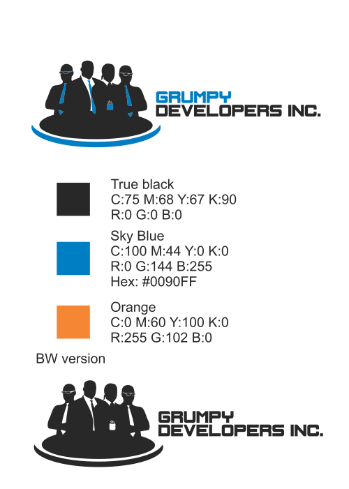
10. Black color on your monitor does not mean same black on clients monitor. When was the last time you have calibrated your monitor? Do you know how to do that? Anyway, escape the trap of color interpretations, by textually defining the colors you have used. I usually give CMYK combination and RGB HEX equivalents. But, I do not do simple conversion within the program, but look for that color in some of the color catalogues and pallets available on the net. Like Pantone.
11. As we are talking about colors, the practice is to deliver to client vector logo in CMYK pallet but also in RGB version (like vector EPS with RGB pallet). On some design platforms this is obligatory. Except if brief of the contest didn’t demand for using a specific pallet.
Kad smo već kod boja, praksa (a na nekim dizajn platformama i obaveza) je klijentu dostaviti vektorski logo u bojama iz CMYK palete, ali i RGB verziju (npr. vektorski EPS fajl sa RGB paletom), osim ako zahtev konkursa nije bio korišćenje specifične palete.
FONTS
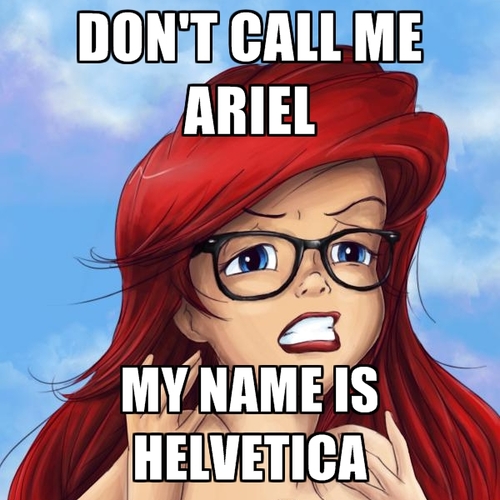
12. If you have, during logo designing, used some font, explain to the client which one you have used. Even if you dont have right of distribution of the font (to give it to the client) note in the description of the work where font can be taken (free of payed). Ofcourse, make sure that client can use them under licenses or without them. Check the licenses for the font.
Book of graphic standards – explained
By book of graphic standards it is defined not only the look of a logo, but his application as well. How much the book will be detailed depends from you, but also from the client and his demands.
Usual parts are:
- Logo application (color, B&W, greyscale)
- Controlled space
- Minimal size of the logo
- Corporate typografi (online and offline)
- Standardized application with defining dimension, applied shapes and backgrounds (stationary, real world applications like caps, clothes, pens…), online applications (like avatars, cover photos…)
Book of graphic standards is also an opportunity for designer to show application of his design work, so that the form of the book is unconstrained.
Again, notice that if book of graphic standards and its content are not explicitly demanded, it is enough to fulfill the first 4 items from the list.Opet, napomena, ukoliko knjiga grafičkih standarda i njen sadržaj nisu eksplicitno zahtevani, dovoljno je ispuniti tačke od 1 do 4. kako je već opisano u savetu broj 7.
There you have it. I hope it was fun to read, and that you have learned something new. Feel free to leave a comment and join the discussion so we could all learn something new.
