I just wanted to tell you three exciting stories that happened to me in the last few days. As you may now, I am the Head of Design at Geelancer but I am also a freelancer. I love to work, all the time, so I do design jobs for other clients. I just love freelancing so much. It keeps me alive. And current with all the design trends.
So, without further a due, I will tell you these three stories. I was hired to think out and create promo material, from which two were only for online use, and one was for offline print use. Of course, I will not mention clients names. I will just say that first was small entrepreneur, second one was huge media company and the last one was nonprofit association.
Promo materials that I was about to do was used for very important event announcements, and it had to include name of that event, time, location and of course the logo of the company.
In this situations, when “small” job is required, I like to be fast and efficient (Designer who is fast? Is that an oxymoron, or just moron?!). So, in order to meet the deadline and do the job, I asked for original logos (vector) in the very beginning. This is how the conversation was going on:
First client:
“Logo?! I don’t have that? Do you want me to take a picture of our memo?”
Second client:
“Logo? Ah-a, in vector? Sure think, I will call our printing office now. They must have it!”. Six hours and one notification later, an email arrived: “Hi! I told our printing office, they will send the mail to you in the morning. They are busy now!”
So, what one designers does in situations like that? Deadline is coming to an end, 5 hours passed. There is nothing else to do but going online an exploring the website of the client, his Facebook and Twitter accounts, while praying to God that they, somehow, have the logo somewhere which I could be able to use or at least reproduce in Illustrator.
Why is reproducing the logo in vector waste of time? Well, for two reasons:
1) If logo is very detailed, and a designer has only pictures of the logo in small resolution, there is high chance that designer will not be able to reproduce all the details. True, right? You will get a logo that resembles, but is not the same as original. There is something called image tracing, or “automatic bitmap conversion into vector format”, which is usable for large size bitmaps. But usually the result of image tracing resembles to logo on the right in this picture!

The fonts! Fonts used in original logo. If they are some generic fonts, then no big deal. I can figure them our easily, even if there are million of fonts in the use.
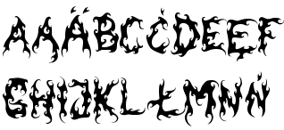
“Dude, its Dark Garden font, how come you didn’t know that?!”

Even worse if your logo has specially designed font, just for you. In that case, you are stuck with hand-writting and reproducing every letter, every character of the font, or spending hours online trying to find other near-matching fonts. Free of course.
I am very sure that, from this stories, you get the idea how I finished these design jobs, within minutes of deadline.
Everything could have been differently.
You probably noticed that we haven’t got to conversation with the third client. It went something like this:
“Logo? A-ham, go to our website, About us section. There is our logo in vector and bitmap format, so use as you like. Also, you have some of our promo pictures there, you can use them as well”.
Ka-BOOM! Local company which has something like book of graphic standards on there webpage?! Impossible. Beside the logo, I found manual for correct use of design with couple of examples! Another Ka-BOOM! There is no need to tell you the amount of my happiness and smile on my face. The job was done in 45 minutes and accepted by the client immediately.
Ok, the conclusion
During logo creation (no matter if its done by marketing agency, freelancer, crowd-sourcing service or your designer) you have to arrange and define the rules of logo use. This is most commonly defined by book of graphic standards, but no one truly knows the importance of one, until problem occurs. I have already wrote about this and you can read it here. You choose how detailed will you define the use of you logo.
This book of graphic standards can be finished as a PDF and put on company website. Or even as a dedicated page on your website.
Some examples of branding/graphic standards to be set?
Here are some:
- Allowed color combinations of the logo and backgrounds where logo goes, with RGB, CMYK and HEX marks, in color and black&white combinations.
- Allowed space around the logo – if you logo will be placed with some other logos, you can define minimal boundary limits.
- Minimal size and dimension of logo
- If your logo has some picture and text, is it use allowed with only one of those?
And many, many more. The goal is simple: Your logo should and have to be ALWAYS used the way you have defined, not the way other people think.


